Our Approach to Case Studies
Our Approach to Case Studies
Every case study explores a real project from start to finish, detailing challenges, the processes we adopted, and the innovative solutions that followed.
These studies are meant to share not just final results but also the discoveries, obstacles, and lessons along the way, with actionable insights included.
Explore below to see how strategic design and problem-solving yielded impactful results for different clients and industries.
Our Approach to Case Studies
Our Approach to Case Studies
Every case study explores a real project from start to finish, detailing challenges, the processes we adopted, and the innovative solutions that followed.
These studies are meant to share not just final results but also the discoveries, obstacles, and lessons along the way, with actionable insights included.
Explore below to see how strategic design and problem-solving yielded impactful results for different clients and industries.
Overview
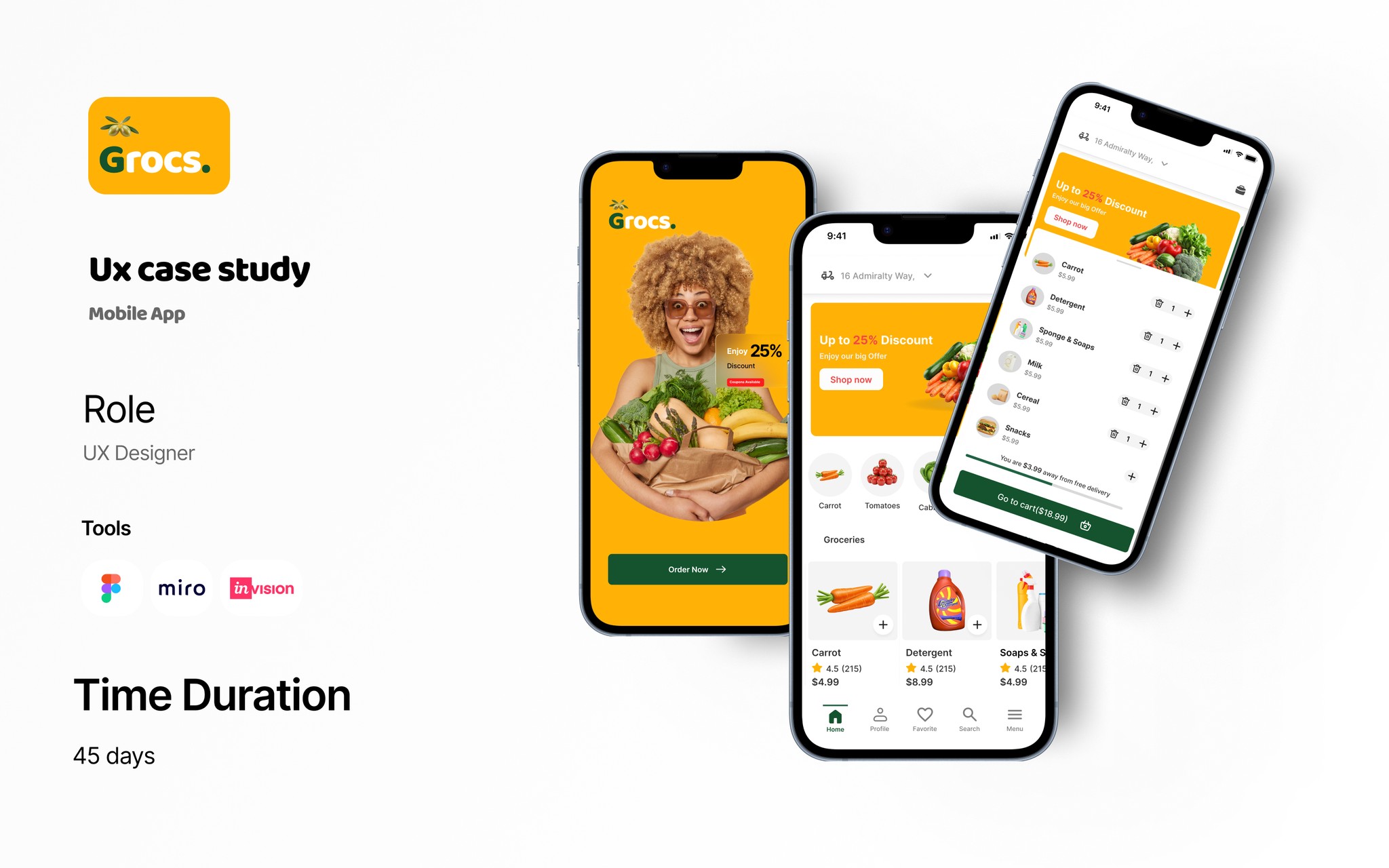
GROCS is a mobile app designed to make grocery shopping faster, simpler, and more budget-friendly.
This case study demonstrates how I applied user-centered design to solve real grocery shopping frustrations.
Problem Statement
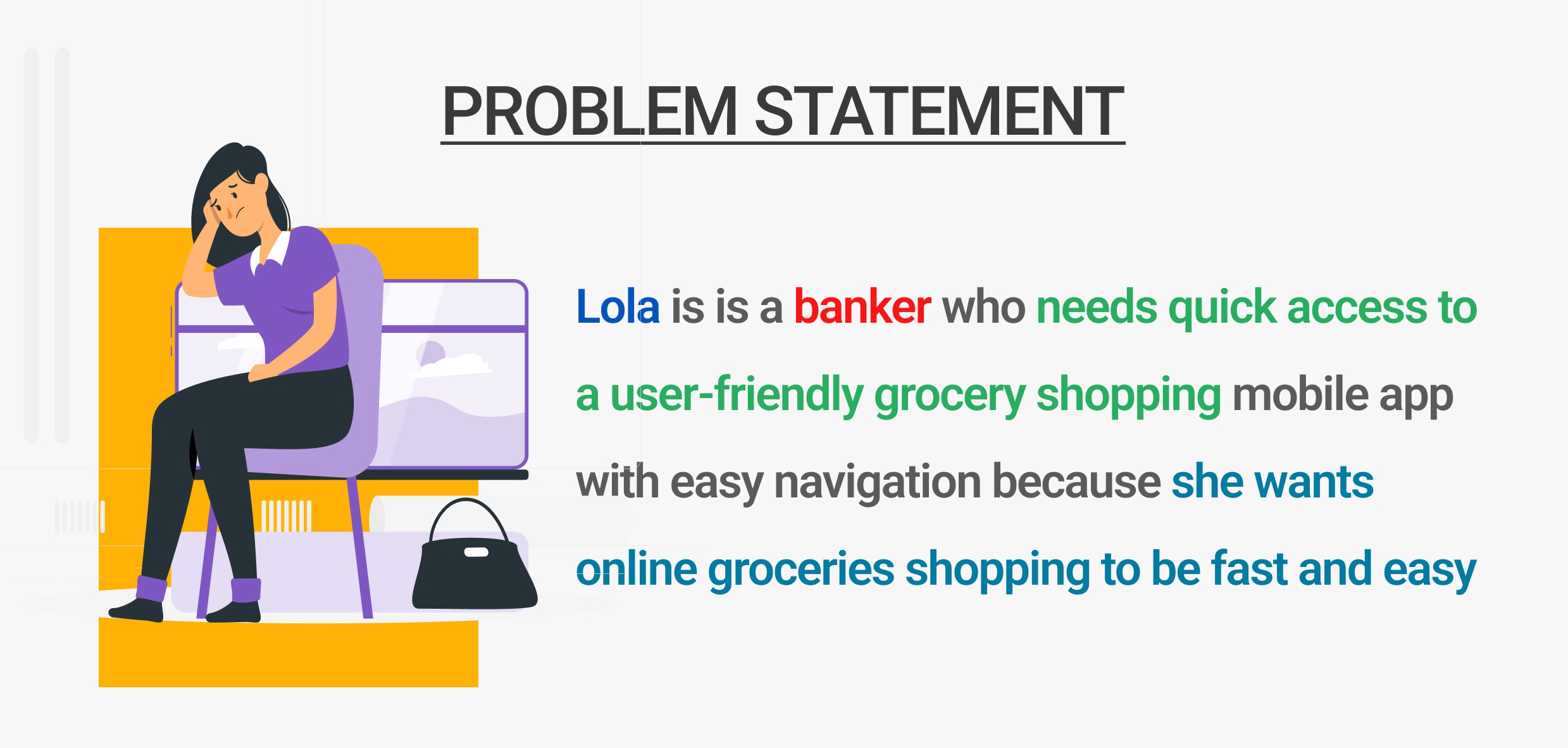
Grocery shoppers around my neighborhood face recurring issues:
Asked what would make their lives easier if they had an app that could solve their problems and save a lot of time.
My competitive analysis involved checking several grocery shopping mobile apps to identify gaps and how they could affect users.
My empathy for users involved certain possibilities that could frustate their daily lives.
Time Pressure – Wasted minutes searching for items and waiting in checkout lines.
Uncertainty – No easy way to check stock before visiting the store to be sure goods are available.
Planning Fatigue – Traffic, Managing lists and budgets without real-time tools.
Goal:
Design a mobile experience that saves time, improves in-store navigation, and makes both in-store and online grocery shopping effortless.

Research
Primary research questions
How long does it take for a user to select and order groceries in the app?
Are users able to successfully order groceries they want?
What can we learn from the steps users took to order groceries?
Are there any parts of the ordering process where users are getting stuck?
Is the payment process easy for the customer?
KPIs
Time on task: how much time users spend ordering a groceries
Conversion rates: how many items customers are ordering
User error rates: how often users get stuck trying to order the items they want
System Usability Scale: a questionnaire to evaluate customer feedback
Methodology
Unmoderated usability study
Location:US, remote (participants will go through the usability study in their own homes)
Date: Sessions will take place between march 12-18.
8 participants will order a pizza through the app. Each participant will then complete a questionnaire on their experience.
Each session will last for 25-30 minutes
Methods Used:
User Interviews – 8 shoppers across different lifestyles.
Competitor Analysis – Westgate lifecare, Dprince supermarket, Ebanor stores.
In-store Observation – 3 local grocery stores.
Key Insights:
80% want to confirm stock availability before shopping.
60 abandon online carts due to slow checkout flows.
40% use shopping lists but rarely update them in real time.
Budget-conscious shoppers want running price totals.

Design Process
1. Define
Personas:
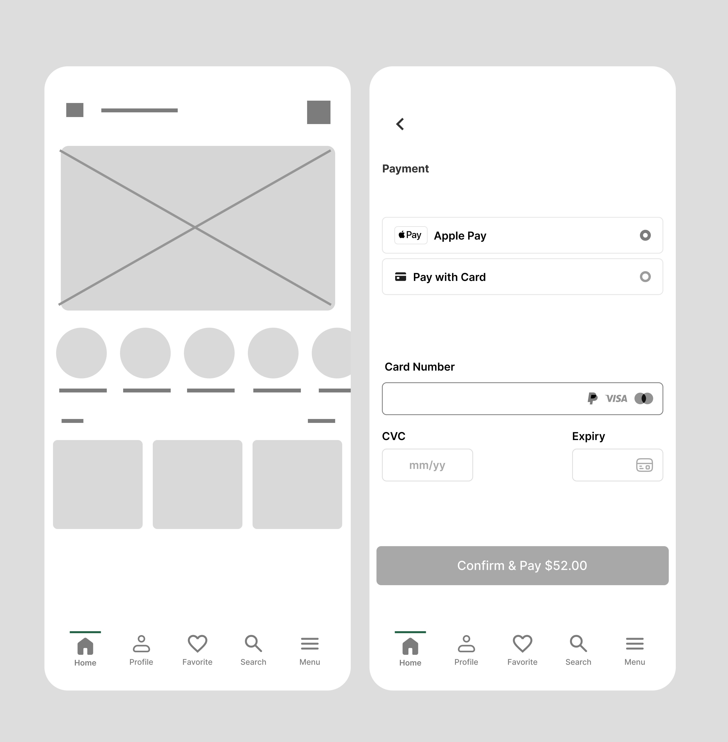
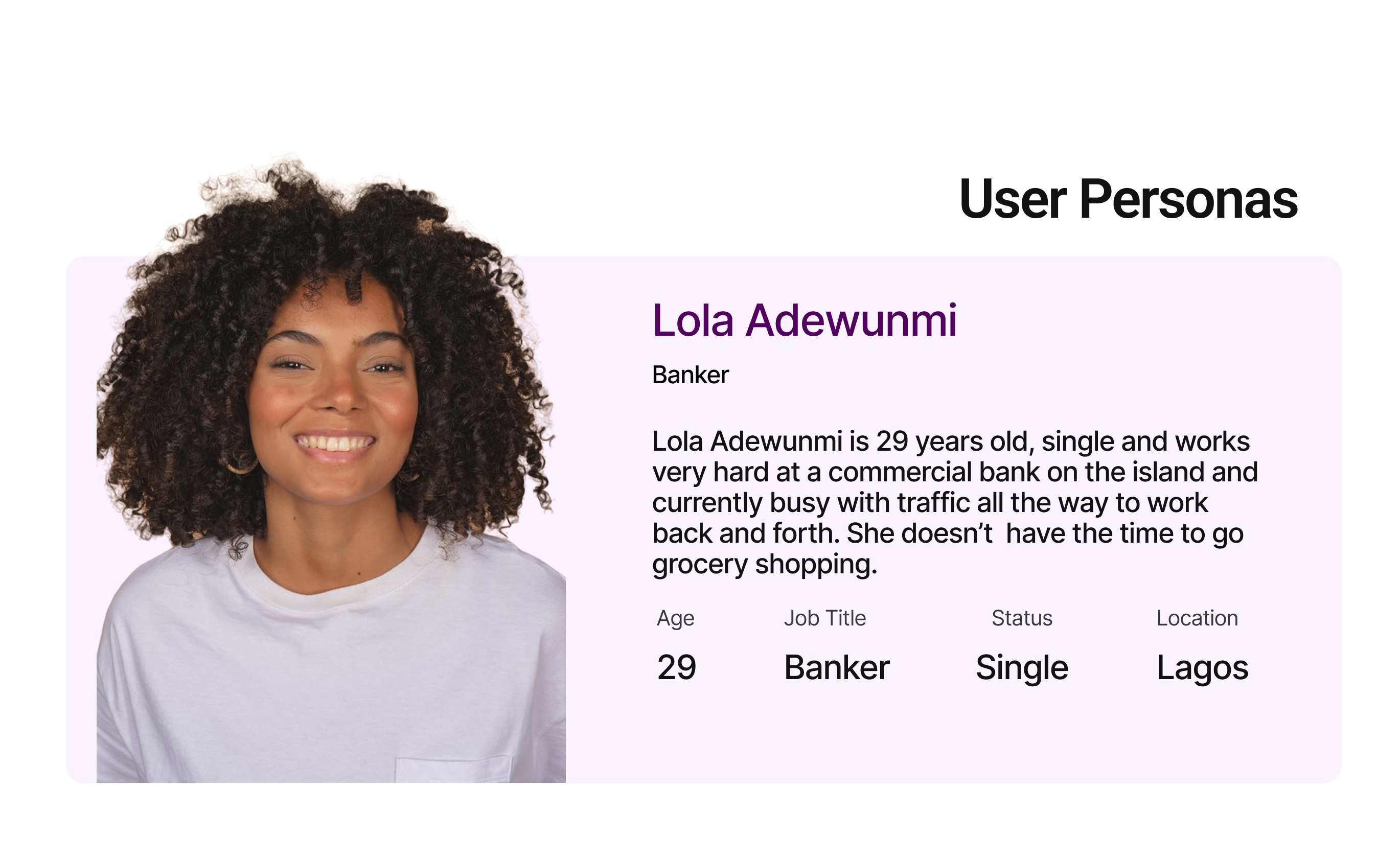
Busy Parent – Needs speed, easy reordering, and delivery.
Young Professional – Values healthy options and deals.
Senior Shopper – Prefers simple navigation and large buttons.
2. Ideate
Potential features:
Real-time stock tracking.
Smart lists with price totals.
Personalized deals and recipes.
One-tap reordering for favorites.
3. Wireframe
Low-fidelity sketches in miro focusing on 3-step checkout instead of 6.
Emphasis on large touch areas and minimal text for quick scanning.
4. Prototype
Interactive prototype for usability testing.
Card sorting to refine navigation labels.
5. Test & Iterate
2 rounds of usability testing (8 participants).
Iterations included:
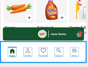
Larger icons for accessibility.
Predictive search with category filters.
Swipe-to-add for faster list building.
Final Solution
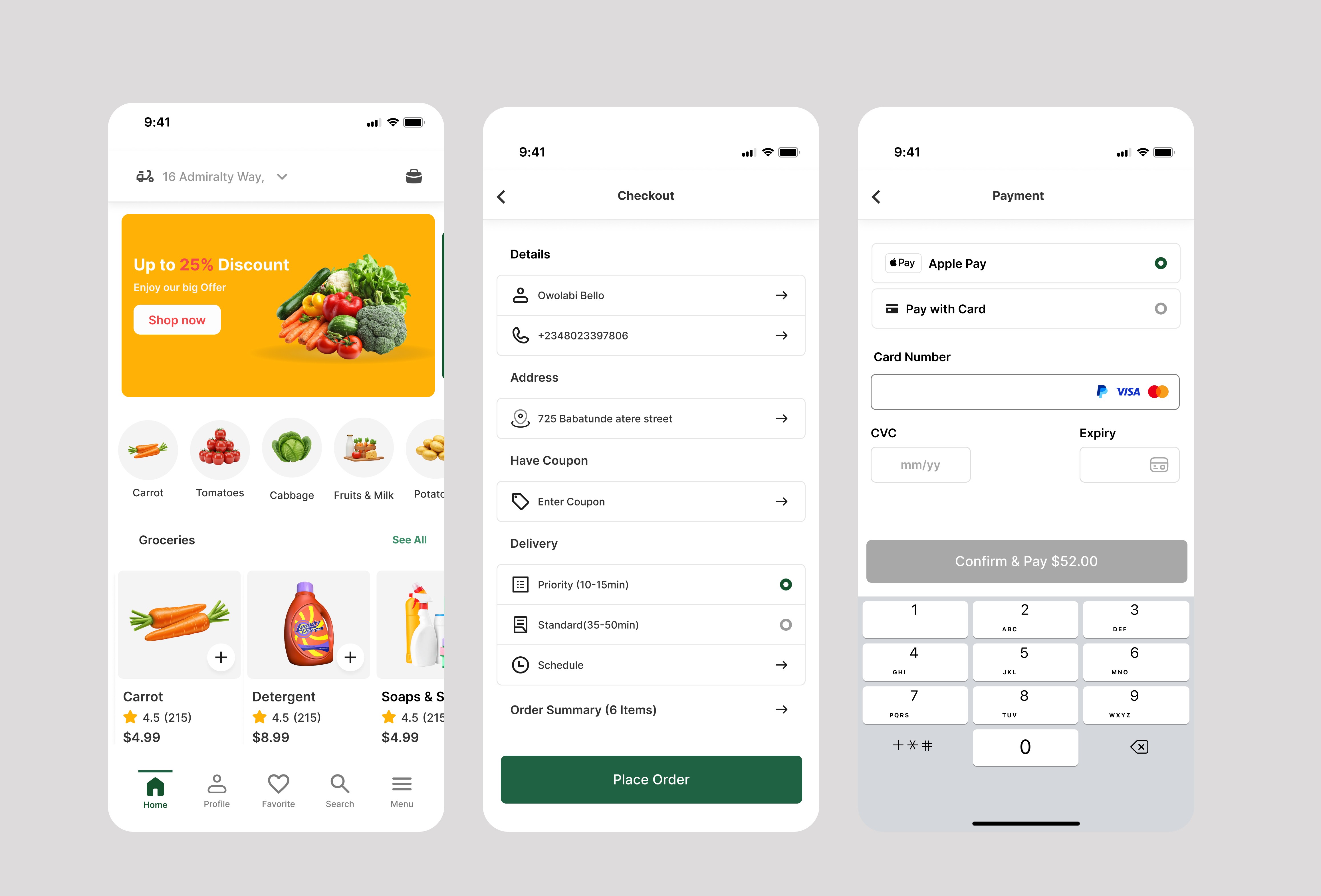
Core Features:
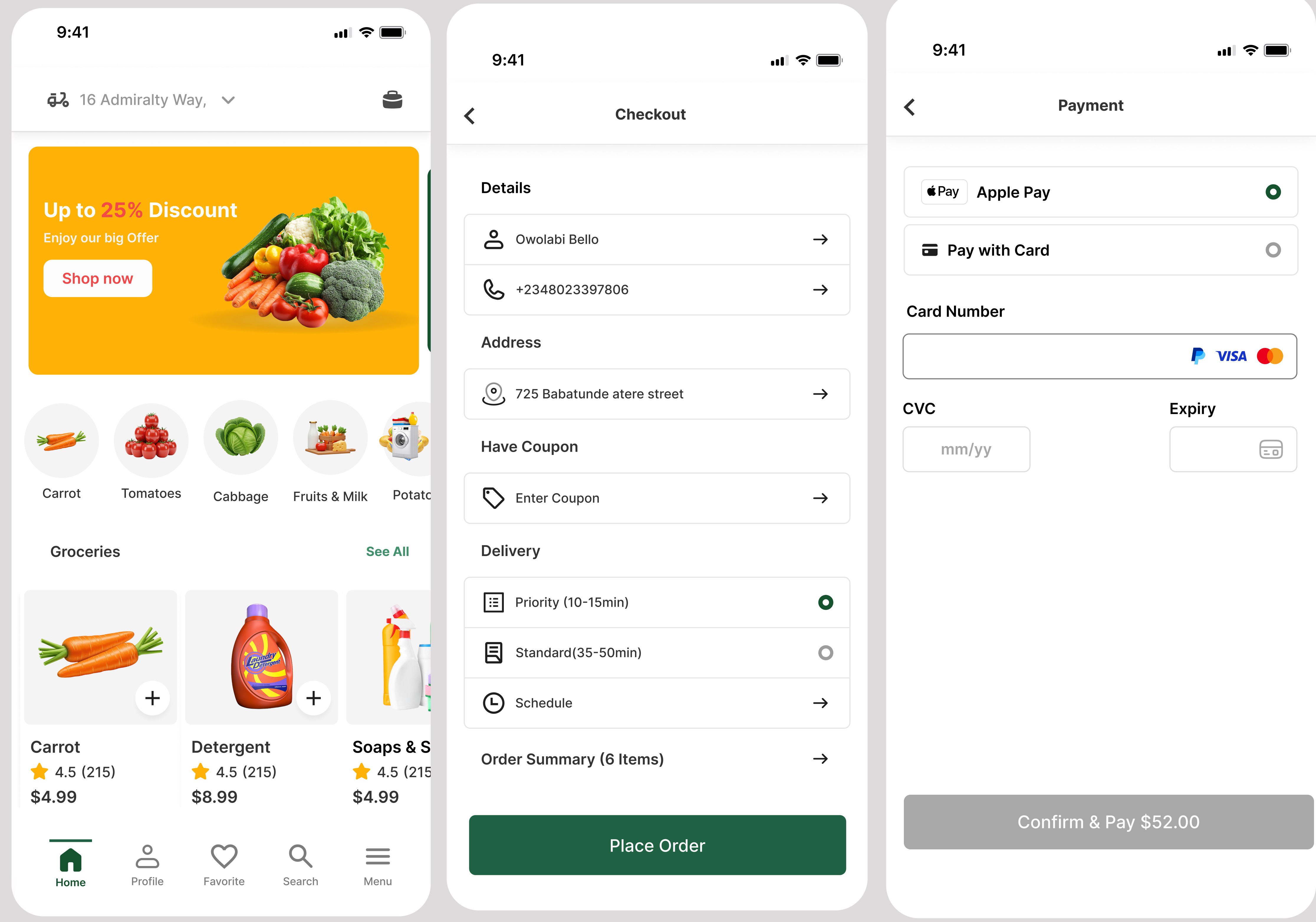
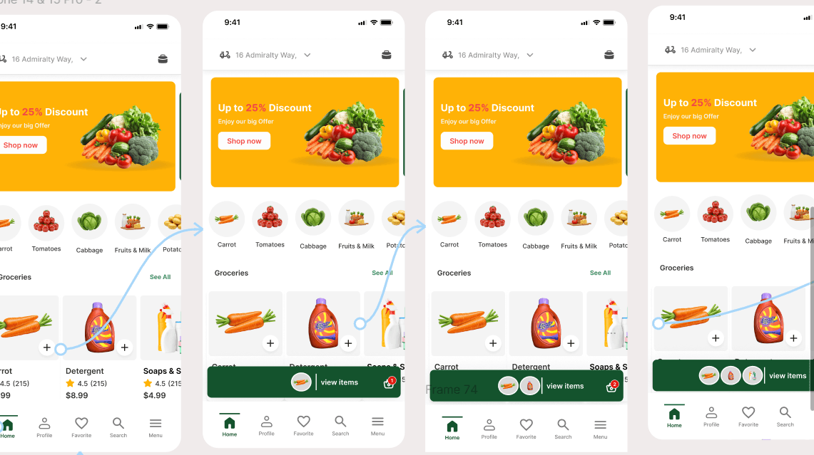
Smart List – Auto-groups items by aisle and updates stock in real time.
Budget Tracker – Running total while adding items to cart.
Quick Checkout – Saved preferences for 1-tap ordering.
Deal Finder – Discounts for early checkout.
In-Store Mode – Scroll Navigation for fast shopping.


Results
Beta Rom testing (4 weeks, 50 users):
Checkout time reduced by 48%.
Cart abandonment down by 35%.
User satisfaction score: 4.6/5 (from 3.2/5).
90% would recommend GROCS to others.

key Takeaways
Speed + personalization addressed most shopping frustrations.
Early usability tests revealed accessibility and navigation gaps.
n-store mode became a surprise favorite for both young professionals and seniors.


Overview
GROCS is a mobile app designed to make grocery shopping faster, simpler, and more budget-friendly.
This case study demonstrates how I applied user-centered design to solve real grocery shopping frustrations.
Problem Statement
Grocery shoppers around my neighborhood face recurring issues:
Asked what would make their lives easier if they had an app that could solve their problems and save a lot of time.
My competitive analysis involved checking several grocery shopping mobile apps to identify gaps and how they could affect users.
My empathy for users involved certain possibilities that could frustate their daily lives.
Time Pressure – Wasted minutes searching for items and waiting in checkout lines.
Uncertainty – No easy way to check stock before visiting the store to be sure goods are available.
Planning Fatigue – Traffic, Managing lists and budgets without real-time tools.
Goal:
Design a mobile experience that saves time, improves in-store navigation, and makes both in-store and online grocery shopping effortless.

Research
Primary research questions
How long does it take for a user to select and order groceries in the app?
Are users able to successfully order groceries they want?
What can we learn from the steps users took to order groceries?
Are there any parts of the ordering process where users are getting stuck?
Is the payment process easy for the customer?
KPIs
Time on task: how much time users spend ordering a groceries
Conversion rates: how many items customers are ordering
User error rates: how often users get stuck trying to order the items they want
System Usability Scale: a questionnaire to evaluate customer feedback
Methodology
Unmoderated usability study
Location:US, remote (participants will go through the usability study in their own homes)
Date: Sessions will take place between march 12-18.
8 participants will order a pizza through the app. Each participant will then complete a questionnaire on their experience.
Each session will last for 25-30 minutes
Methods Used:
User Interviews – 8 shoppers across different lifestyles.
Competitor Analysis – Westgate lifecare, Dprince supermarket, Ebanor stores.
In-store Observation – 3 local grocery stores.
Key Insights:
80% want to confirm stock availability before shopping.
60 abandon online carts due to slow checkout flows.
40% use shopping lists but rarely update them in real time.
Budget-conscious shoppers want running price totals.


Design Process
1. Define
Personas:
Busy Parent – Needs speed, easy reordering, and delivery.
Young Professional – Values healthy options and deals.
Senior Shopper – Prefers simple navigation and large buttons.
2. Ideate
Potential features:
Real-time stock tracking.
Smart lists with price totals.
Personalized deals and recipes.
One-tap reordering for favorites.
3. Wireframe
Low-fidelity sketches in miro focusing on 3-step checkout instead of 6.
Emphasis on large touch areas and minimal text for quick scanning.
4. Prototype
Interactive prototype for usability testing.
Card sorting to refine navigation labels.
5. Test & Iterate
2 rounds of usability testing (8 participants).
Iterations included:
Larger icons for accessibility.
Predictive search with category filters.
Swipe-to-add for faster list building.
Final Solution
Core Features:
Smart List – Auto-groups items by aisle and updates stock in real time.
Budget Tracker – Running total while adding items to cart.
Quick Checkout – Saved preferences for 1-tap ordering.
Deal Finder – Discounts for early checkout.
In-Store Mode – Scroll Navigation for fast shopping.


Results
Beta Rom testing (4 weeks, 50 users):
Checkout time reduced by 48%.
Cart abandonment down by 35%.
User satisfaction score: 4.6/5 (from 3.2/5).
90% would recommend GROCS to others.

key Takeaways
Speed + personalization addressed most shopping frustrations.
Early usability tests revealed accessibility and navigation gaps.
n-store mode became a surprise favorite for both young professionals and seniors.


Overview
GROCS is a mobile app designed to make grocery shopping faster, simpler, and more budget-friendly.
This case study demonstrates how I applied user-centered design to solve real grocery shopping frustrations.
Problem Statement
Grocery shoppers around my neighborhood face recurring issues:
Asked what would make their lives easier if they had an app that could solve their problems and save a lot of time.
My competitive analysis involved checking several grocery shopping mobile apps to identify gaps and how they could affect users.
My empathy for users involved certain possibilities that could frustate their daily lives.
Time Pressure – Wasted minutes searching for items and waiting in checkout lines.
Uncertainty – No easy way to check stock before visiting the store to be sure goods are available.
Planning Fatigue – Traffic, Managing lists and budgets without real-time tools.
Goal:
Design a mobile experience that saves time, improves in-store navigation, and makes both in-store and online grocery shopping effortless.

Research
Primary research questions
How long does it take for a user to select and order groceries in the app?
Are users able to successfully order groceries they want?
What can we learn from the steps users took to order groceries?
Are there any parts of the ordering process where users are getting stuck?
Is the payment process easy for the customer?
KPIs
Time on task: how much time users spend ordering a groceries
Conversion rates: how many items customers are ordering
User error rates: how often users get stuck trying to order the items they want
System Usability Scale: a questionnaire to evaluate customer feedback
Methodology
Unmoderated usability study
Location:US, remote (participants will go through the usability study in their own homes)
Date: Sessions will take place between march 12-18.
8 participants will order a pizza through the app. Each participant will then complete a questionnaire on their experience.
Each session will last for 25-30 minutes
Methods Used:
User Interviews – 8 shoppers across different lifestyles.
Competitor Analysis – Westgate lifecare, Dprince supermarket, Ebanor stores.
In-store Observation – 3 local grocery stores.
Key Insights:
80% want to confirm stock availability before shopping.
60 abandon online carts due to slow checkout flows.
40% use shopping lists but rarely update them in real time.
Budget-conscious shoppers want running price totals.


Design Process
1. Define
Personas:
Busy Parent – Needs speed, easy reordering, and delivery.
Young Professional – Values healthy options and deals.
Senior Shopper – Prefers simple navigation and large buttons.
2. Ideate
Potential features:
Real-time stock tracking.
Smart lists with price totals.
Personalized deals and recipes.
One-tap reordering for favorites.
3. Wireframe
Low-fidelity sketches in miro focusing on 3-step checkout instead of 6.
Emphasis on large touch areas and minimal text for quick scanning.
4. Prototype
Interactive prototype for usability testing.
Card sorting to refine navigation labels.
5. Test & Iterate
2 rounds of usability testing (8 participants).
Iterations included:
Larger icons for accessibility.
Predictive search with category filters.
Swipe-to-add for faster list building.
Final Solution
Core Features:
Smart List – Auto-groups items by aisle and updates stock in real time.
Budget Tracker – Running total while adding items to cart.
Quick Checkout – Saved preferences for 1-tap ordering.
Deal Finder – Discounts for early checkout.
In-Store Mode – Scroll Navigation for fast shopping.


Results
Beta Rom testing (4 weeks, 50 users):
Checkout time reduced by 48%.
Cart abandonment down by 35%.
User satisfaction score: 4.6/5 (from 3.2/5).
90% would recommend GROCS to others.

key Takeaways
Speed + personalization addressed most shopping frustrations.
Early usability tests revealed accessibility and navigation gaps.
n-store mode became a surprise favorite for both young professionals and seniors.


Overview
GROCS is a mobile app designed to make grocery shopping faster, simpler, and more budget-friendly.
This case study demonstrates how I applied user-centered design to solve real grocery shopping frustrations.
Problem Statement
Grocery shoppers around my neighborhood face recurring issues:
Asked what would make their lives easier if they had an app that could solve their problems and save a lot of time.
My competitive analysis involved checking several grocery shopping mobile apps to identify gaps and how they could affect users.
My empathy for users involved certain possibilities that could frustate their daily lives.
Time Pressure – Wasted minutes searching for items and waiting in checkout lines.
Uncertainty – No easy way to check stock before visiting the store to be sure goods are available.
Planning Fatigue – Traffic, Managing lists and budgets without real-time tools.
Goal:
Design a mobile experience that saves time, improves in-store navigation, and makes both in-store and online grocery shopping effortless.

Research
Primary research questions
How long does it take for a user to select and order groceries in the app?
Are users able to successfully order groceries they want?
What can we learn from the steps users took to order groceries?
Are there any parts of the ordering process where users are getting stuck?
Is the payment process easy for the customer?
KPIs
Time on task: how much time users spend ordering a groceries
Conversion rates: how many items customers are ordering
User error rates: how often users get stuck trying to order the items they want
System Usability Scale: a questionnaire to evaluate customer feedback
Methodology
Unmoderated usability study
Location:US, remote (participants will go through the usability study in their own homes)
Date: Sessions will take place between march 12-18.
8 participants will order a pizza through the app. Each participant will then complete a questionnaire on their experience.
Each session will last for 25-30 minutes
Methods Used:
User Interviews – 8 shoppers across different lifestyles.
Competitor Analysis – Westgate lifecare, Dprince supermarket, Ebanor stores.
In-store Observation – 3 local grocery stores.
Key Insights:
80% want to confirm stock availability before shopping.
60 abandon online carts due to slow checkout flows.
40% use shopping lists but rarely update them in real time.
Budget-conscious shoppers want running price totals.


Design Process
1. Define
Personas:
Busy Parent – Needs speed, easy reordering, and delivery.
Young Professional – Values healthy options and deals.
Senior Shopper – Prefers simple navigation and large buttons.
2. Ideate
Potential features:
Real-time stock tracking.
Smart lists with price totals.
Personalized deals and recipes.
One-tap reordering for favorites.
3. Wireframe
Low-fidelity sketches in miro focusing on 3-step checkout instead of 6.
Emphasis on large touch areas and minimal text for quick scanning.
4. Prototype
Interactive prototype for usability testing.
Card sorting to refine navigation labels.
5. Test & Iterate
2 rounds of usability testing (8 participants).
Iterations included:
Larger icons for accessibility.
Predictive search with category filters.
Swipe-to-add for faster list building.
Final Solution
Core Features:
Smart List – Auto-groups items by aisle and updates stock in real time.
Budget Tracker – Running total while adding items to cart.
Quick Checkout – Saved preferences for 1-tap ordering.
Deal Finder – Discounts for early checkout.
In-Store Mode – Scroll Navigation for fast shopping.


Results
Beta Rom testing (4 weeks, 50 users):
Checkout time reduced by 48%.
Cart abandonment down by 35%.
User satisfaction score: 4.6/5 (from 3.2/5).
90% would recommend GROCS to others.

key Takeaways
Speed + personalization addressed most shopping frustrations.
Early usability tests revealed accessibility and navigation gaps.
n-store mode became a surprise favorite for both young professionals and seniors.
Overview
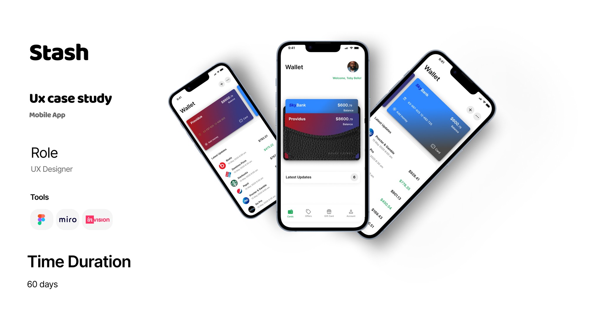
Stash is a mobile wallet app that helps users send, receive, and manage money instantly.
The mission: build a secure, simple, and fast experience for both first-time and experienced digital wallet users.
Problem Statement
Existing wallet apps often suffer from:
Long and complicated onboarding
Crowded dashboards with too many features
Lack of clear transaction status and fee transparency
User pain point:
“I want to send money in seconds and know it’s safe without hidden fees.”
Target Audience
Young professionals (20–35) sending money frequently
Freelancers getting paid by clients
Small business owners managing daily transactions
Design goals
Onboard users in under 2 minutes
Provide instant transaction feedback
Make the dashboard focused on core actions: Send, Receive, History, Cards
Build trust through strong security cues and clean UI
Key Features
Real-time transaction status tracker
Fee transparency before every transfer
Secure QR code payments
Savings Vault for automated micro-savings
Usability Testing and Ananlysis
Added “View Receipt” button after transactions for quick access
Switched from icon-only actions to labeled buttons for clarity
Result
Onboarding time: Reduced from 4 mins → 1 min 45 sec
Success rate: 95% of test users completed transfers without guidance
User sentiment: “Clean, fast, and feels safe.”
Reflection
Stash showed me that speed + clarity builds more trust than security pop-ups alone.
Next iteration: integrate bill payments and a crypto wallet feature.

Overview
Stash is a mobile wallet app that helps users send, receive, and manage money instantly.
The mission: build a secure, simple, and fast experience for both first-time and experienced digital wallet users.
Problem Statement
Existing wallet apps often suffer from:
Long and complicated onboarding
Crowded dashboards with too many features
Lack of clear transaction status and fee transparency
User pain point:
“I want to send money in seconds and know it’s safe without hidden fees.”
Target Audiences
Young professionals (20–35) sending money frequently
Freelancers getting paid by clients
Small business owners managing daily transactions
Design goals
Onboard users in under 2 minutes
Provide instant transaction feedback
Make the dashboard focused on core actions: Send, Receive, History, Cards
Build trust through strong security cues and clean UI
Key Features
Usability Testing and Ananlysis
Added “View Receipt” button after transactions for quick access
Switched from icon-only actions to labeled buttons for clarity
Real-time transaction status tracker
Fee transparency before every transfer
Secure QR code payments
Savings Vault for automated micro-savings
Result
Onboarding time: Reduced from 4 mins → 1 min 45 sec
Success rate: 95% of test users completed transfers without guidance
User sentiment: “Clean, fast, and feels safe.”
Reflection
Stash showed me that speed + clarity builds more trust than security pop-ups alone.
Next iteration: integrate bill payments and a crypto wallet feature.

Overview
Stash is a mobile wallet app that helps users send, receive, and manage money instantly.
The mission: build a secure, simple, and fast experience for both first-time and experienced digital wallet users.
Problem Statement
Existing wallet apps often suffer from:
Long and complicated onboarding
Crowded dashboards with too many features
Lack of clear transaction status and fee transparency
User pain point:
“I want to send money in seconds and know it’s safe without hidden fees.”
Target Audiences
Young professionals (20–35) sending money frequently
Freelancers getting paid by clients
Small business owners managing daily transactions
Design goals
Onboard users in under 2 minutes
Provide instant transaction feedback
Make the dashboard focused on core actions: Send, Receive, History, Cards
Build trust through strong security cues and clean UI
Key Features
Usability Testing and Ananlysis
Added “View Receipt” button after transactions for quick access
Switched from icon-only actions to labeled buttons for clarity
Real-time transaction status tracker
Fee transparency before every transfer
Secure QR code payments
Savings Vault for automated micro-savings
Result
Onboarding time: Reduced from 4 mins → 1 min 45 sec
Success rate: 95% of test users completed transfers without guidance
User sentiment: “Clean, fast, and feels safe.”
Reflection
Stash showed me that speed + clarity builds more trust than security pop-ups alone.
Next iteration: integrate bill payments and a crypto wallet feature.
Reviews
“Working with Owolabi was a turning point, details, communication, and results far exceeded our expectations.”

Seyi Agbaje
Rating 5.0
Reviews
“Working with Owolabi was a turning point, details, communication, and results far exceeded our expectations.”

Seyi Agbaje
Rating 5.0
Reviews
“Working with Owolabi was a turning point, details, communication, and results far exceeded our expectations.”

Seyi Agbaje
Rating 5.0
Reviews
“Working with Owolabi was a turning point, details, communication, and results far exceeded our expectations.”

Seyi Agbaje
Rating 5.0
Google UX Design Certification
Google UX Design Certification
Google UX Design Certification
Google UX Design Certification
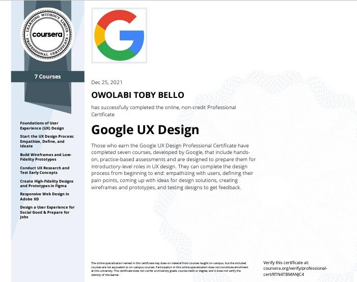
Achieved UX Design Certification in December 2021, gaining advanced skills in user research, wireframing, prototyping, usability testing, and accessibility best practices. Learned to create intuitive, human-centered digital experiences using industry-standard tools and design systems.
What’s included in a case study?
Each case study features project background, challenges, solutions, outcomes, and reflections.
How are projects selected?
Projects are chosen based on their potential for insight, learning, and real-world impact.
Can I request more project details?
Yes, use the contact form or email for more in-depth information about any case study.
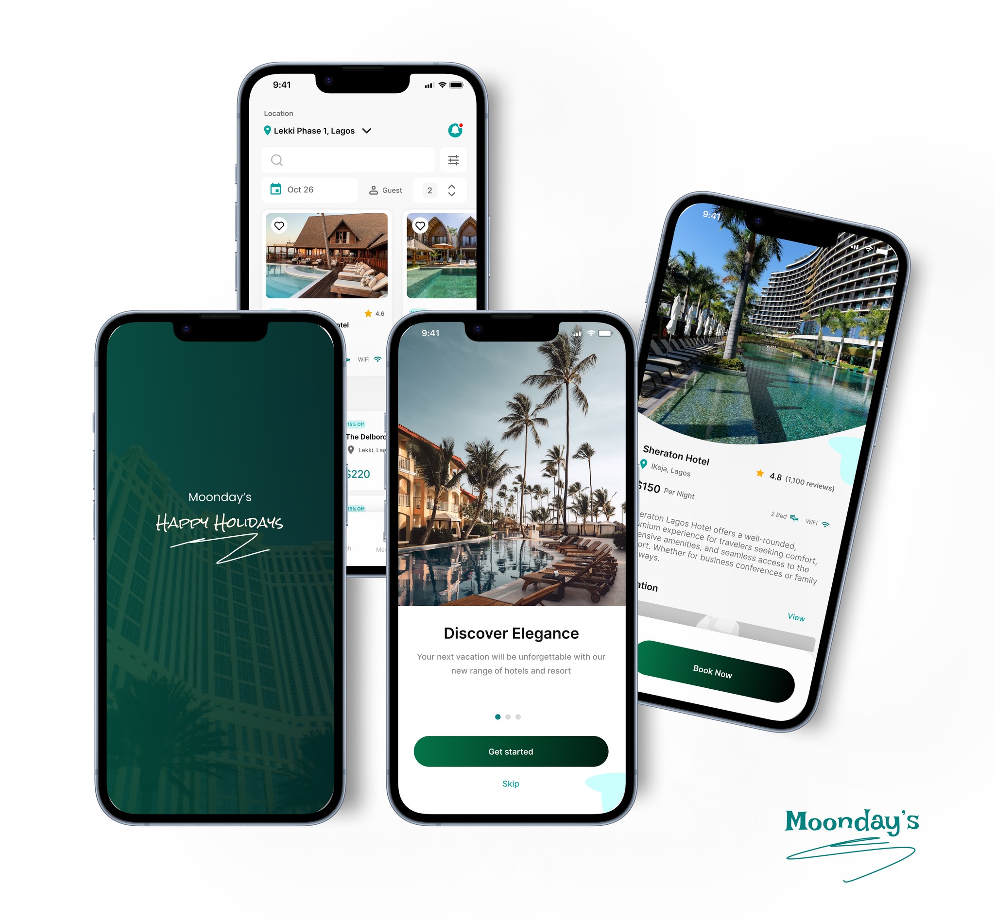
Moonday's Hotel Booking Mobile App.
Simple, bold.
Simple, bold.
